Showing posts with label Anniversary/Wedding Cards. Show all posts

Thursday, March 22, 2012

Happy 43rd!

My parents were married the First Day of Spring. I find that incredibly romantic, much more so than Valentine's Day or Christmas weddings. There's something about spring. Sun, warmer weather, flowers blooming, birds chirping, new beginnings. It's also really easy for me to remember that it's their anniversary ;)


To celebrate these 43 years of marriage I made them a card. I went for a simple look today, based on this week's Freshly Made Sketch. Instead of circles, as suggested in the sketch, I pulled out my Framelits and used the hearts. This is definitely a unique sketch and I love how fresh and clean the card turned out. I used the Attic Boutique DSP which is full of fresh, romantic colors and flowers.

I'll be seeing my parents tomorrow and I really hope they like this card. I'm not 100% sure where I got the idea to make a heart frame and run a ribbon through it. But I love how it turned out! 


Tips & Tricks:

*Anyone who has stamped with me knows how much I love my 3D punched shapes. I've used the butterflies a lot, but lately I've been loving the 3D hearts.
*Aren't Adhesive Pearls just so romantic? I think they add a classic touch to the card.
*When making a frame with the Framelits, cut out the larger shape first and only then cut the smaller heart out to make your frame. This will prevent the Framelits from slipping onto each other.
*I contemplated using the Pool Party Seam Binding Ribbon but it seemed a bit too wide for the heart frame. I used the Ruffled Ribbon instead and I think it was just the right size.
*Sometimes less is more. I could have embossed the Whisper White Card Stock, I could have added some more embellishments, but for this card, I wanted to keep it simple and *fresh*.

I'll let you know next time what my parents thought. 'Til then, keep letting stamps bring out your creativity!

Sunday, December 11, 2011

Sale-a-Bration will be here soon...

With my Occasions Mini Preorder, I was also able to preorder some Sale-a-Bration (SAB) exclusive stamp sets and accessories. How exciting!!! Even more stuff. Even better was I got it all FREE ~ I love being a demonstrator :)

What is SAB? It's the most wonderful time of the year for SU! customers, hostesses and demonstrators, and runs from January 24th to March 31st. As a customer, you get to choose 1 FREE SAB item with every $60 in merchandise you order! What types of free items are we talking about? SAB exclusive stamps, designer papers and accessories, as well as some catalog merchandise such as the Brights Designer Buttons and Stripes Embossing Folder. Wait, it gets better! There's NO LIMIT!!! If you join SU! during SAB, you get your Starter Kit for $150 (tax free in Ontario ~ Canada only) as well as a FREE package of Designer Paper every month 'til December 2012. Do you see a trend? As in FREE???

You can take advantage of this awesome Demo Starter Deal before Sale-a-Bration through me because I'm going to Stampin' Up! Leadership conference. Sign up on December 13th or 14th and get your business off to a great start in the new year, taking advantage of Sale-a-Bration right from the get-go!!! You can sign up easily at www.stampingwithmonica.com ~ but only December 13th and 14th for the $150 + free DSP deal :)

This week's Pals Paper Arts Challenge asked us to dress up our card for a special occasion. I used some new SAB goodies as well as the Labels Framelits to dress up my card:


Tips & Tricks:

*Love the ribbon? So do I! It's the new Lucky Limeade and Calypso Coral Organdy Ribbon. Get 10 yards of each PLUS 30 Everyday Enchantment Printed Brads (top left - Pool Party flower brad) in a SAB bundle. The ribbon is nice and narrow, but a good weight. Just gorgeous.
*The DSP is also the SAB Everyday Enchantment DSP and it is beautiful. The snippits in the brochure do NOT do it justice!
*I wasn't sure about the SAB Fresh Vintage stamp set, but it's has definitely grown on me. The larger flower image fits perfectly into a medium Labels Framelit. Because the Framelit has not center (it's a frame - go figure ;) ) you can position it perfectly on your stamped image. The square stamp coordinates perfectly with the 1" Square Punch.
*I love the Framelits. I've never used a similar product. I did, however, learn the hard way that making a frame is a two-step process. First cut out your larger die-cut. Then, position the smaller framelit on your larger die-cut and cut out your frame. DO NOT put both the large and small framelits on at the same time... you run the risk of them shifting in the Big Shot and cuttin into each other ~ been there, done that and even though the framelits are super sturdy, I wouldn't want to do it again ;)

Wow! Long post... That's it for today, keep letting stamps bring out your creativity!

Wednesday, October 12, 2011

A 'Fresh' Flower

I love the sketches at Freshly Made Sketches. They are fun, modern and 'fresh' :) After doing a Christmas card on Monday and prepping a few Christmas classes I needed to do something different.

Even though it's fall, I wanted to do something bright and cheery. So I pulled out my Melon Mambo Embossing Powder, one of my fave stamp sets Just Believe, our lovely Hostess Cheerful Treat Designer Series Paper and made this fresh, flowery card. Don't you just love the Limeade DSP with Melon Mambo polka dots? I love this DSP ~ so many fabulous patterns to choose from!


Tips & Tricks:
*Love the new colored embossing powders? Rub some Embossing Buddy over your card stock before embossing to avoid little flecks of embossing powder in places other than your image.
*When using a lot of the same colors for bases and backgrounds, use Stampin' Dimensionals to pop up your images a bit and to add contrast.
*Sometimes I make a card without an intended recipient. So I leave it blank and then it can be anything I want it to be :)

Can't wait to stamp something a bit more seasonal again tomorrow but I've gotta mix it up sometimes. 'Til then, keep letting stamps bring out your creativity!

Monday, October 3, 2011

Pretty Vintage Vogue

It feels like all I've been doing the last few weeks is Christmas and Hallowe'en projects. I did do a bright, cheery card last week but I feel like I've been ignoring the beautiful new 2011-2013 In Colors and had to pull them out again. As well as the gorgeous Ruffled In Color Ribbon. I also pulled out a stamp set that is beautiful, that I love, but tends to go ignored from time to time, Vintage Vogue.


The layout for my card was inspired by this week's Mojo Monday Challenge. It's a little out of my box with the angled ribbon and multiple different sized layers but I think I'll use it again! Aren't these colors just lovely and cheerful? Great for another dreary Ottawa day.

Tips & Tricks:
*Although the new Snowburst Embossing Folder is quite busy, it's perfect to add a bit of texture to an intermediate layer.
*Don't you just love the In Color Printed Brads? They're perfect for flower centers, accents and pretty much anything else!
*So many stampers are afraid to cut out images... why? I just don't get it! It adds so much when you can layer the gorgeous flowers and images. And even if you can't cut perfectly, your card will still look great. Look at my images - I'm certainly no excellent cutter... but were those the details you were looking at?
*Something was missing from this card. I thought of adding the Dazzling Details glitter glue onto the flowers but I didn't think it would look right. So I took out my too-often-ignored Vanilla Smooch Spritz and spritzed the finished product, including the ribbon! Love. It. Such a small touch, but adds so much :)


I really love how this card turned out - now I have to figure out who to give it to. I don't have any birthdays coming up! I'm sure I'll find someone special soon enough. 'Til next time, keep letting stamps bring out your creativity!

Thursday, July 14, 2011

Sweet Summer Inspiration

We were given the image at the left to use as our inspiration for this week's Pals Paper Arts Challenge. I love the aged wood (Crumb Cake and Soft Suede), the blues (Pool Party and Baja Breeze) and the Whites (Whisper White). Because I have soooo many new stamp sets to play with, I again made two cards ;) 

I used Established Elegance for the first one. Have I mentioned how much I LOVE this stamp set? I especially love the typewriter. I don't know why... but it's what attracted me to this set. I love the other images too, but the typewriter, I don't know, I just love it :) Nothing says vintage quite like a typewriter.


For the second card, I used Patterned Party. I absolutely love this birthday card stamp set. It's great for kids cards, great for adults cards. It just works. And in keeping with the summer theme, I used Pool Party and Soft Suede as my main colors, with the 2011-2013 In Colors as accents.


Little hints:

*The Seam Binding ribbon (Very Vanilla on the card to the right) is great for the ruffling technique. Run a bit of Snail along your card where you want to adhere the ribbon and ruffle your ribbon randomly. This technique can also be easily done with the 3/8" Taffeta Ribbon.
*SU! card stock is thicker than most, so when you distress it with your bone folder (such as curling the edges) you can split the layers apart to give it an aged look.
*Sponging the edges of your card stock is an easy and cost-effective way to achieve and aged look.
*Want to stamp an image in several different colors? Use Stampin' Up!'s Stampin' Write Markers. They contain the same ink as the ink pads and you can stamp with them.

Hope these two cards helped you fall in love with some new stamp sets and keep letting stamps bring out your creativity!

Monday, July 4, 2011

Artistic Etchings Mojo

I know, I know - I just used this set on a recent Mojo Monday Challenge. But as I was going through the samples on my board today, removing the ones with retired sets, DSP and accessories, I realized I had removed all of my vintagey samples and samples using the Artistic Etchings stamp set.

This week's Mojo sketch lent itself perfectly to a vintage-looking card, using the First Edition DSP (now in the 2011/2012 IB&C) and some seam binding ribbon. I just love how Cherry Cobbler, Early Espresso, and Crumb Cake look good together.


Little hints:

*Love the 'ruffled ribbon' look? It's easy to do, especially with pliable ribbons such as the 3/8" Taffeta and Seam Binding ribbons. Just run a length of SNAIL adhesive where you want the ribbon, cut an extra long length that will allow the ruffles (I advise you to err on the side of caution and cut more than you think you'll need) and ruffle haphazardly. This technique is definitely not about minute details ;)
*Use Soft Suede ink to add a bit of vintage feel to your cards. I sponged the edges of the DSP, the Very Vanilla card stock with it. I also use the Color Spritzer Tool and Soft Suede Stampin' Write Marker to spritz a bit of color on the card.
*Accidentally tear some card stock or DSP? No problem!  Incorporate it in the card ;) I accidentally tore the top right corner of the DSP when doing the ribbon ruffling. To make it look intentional I also tore the bottom left corner and sponged over it with Soft Suede ink. It just adds to the vintage feel!
*I love those Trinket Keys. I used Mini Glue Dots to adhere it to this card.
*Although Artistic Etchings is a great set for vintage cards, I'm impatiently waiting for my newest vintage stamp set to arrive - Established Elegance. I just love the type writer and the dress form ;)  See it in my Online Store.

How are you liking the new cattie? What are your favorites? I can't wait to have even more new sets and embellies to play with and show off to you!  For now, keep letting your current stamps bring out your creativity!

Wednesday, June 22, 2011

Vintage Tri Shutter Card

For this week's Mojo Monday card (well, more like Mojo Wednesday card - I was busy!) I did a tri shutter card. We'll also be making this card at my stamper's group this week-end. You'll notice that my card has the semi-circle on the left shutter and the oval/square/strip on right shutter.

I did add the butterflies to the card, because it needed a little something extra. There's a lot more space to fill on a tri shutter card then on a regular 4-1/4" x 5-1/2" card! I'm not sure who I'll be giving this very special card to, but I love it!


Little hints:

*Like the vintage look? The retiring Newsprint DSP, Artistic Etchings stamp set and Vintage Wallpaper embossing folder are perfect for this popular style!  And don't forget to sponge your DSP and butterflies with Soft Suede ink. It's GREAT for 'vintagizing' your work.
*Although the adhesive pearls would be more 'vintage', I really liked the rhinestones for this project.
*Love the Early Espresso Taffeta and Satin ribbons? They're retiring as well!  Get them before they're gone for good in my ONLINE Store.
*Although most of my card is Early Espresso and the Newsprint DSP, I added a bit of Crumb Cake (center butterfly) and Cherry Cobbler to jazz the card up!
*Love the butterflies? It's the Sizzix Bigz Beautiful Butterflies die, one of my faves :)
*Want to make a Tri Shutter card yourself? Here's the tutorial: http://www.splitcoaststampers.com/resources/tutorials/trishuttercard/

Hope you liked this tri shutter card and keep letting stamps bring out your creativity!

Monday, May 2, 2011

A little Anniversary Mojo

Tomorrow is my and my husband's 9th Wedding Anniversary. I can hardly believe it! To celebrate this special day I of course made my hubby a card. Mojo Monday had a gorgeous sketch that I thought would work well with the Artistic Etchings Stamp Set and Trinket Key I was planning on using for my card. This Anniversary post is also very fitting because this is my 100th blog post!!!  I can't believe it!

I used the Newsprint Designer Series Paper in the current IB&C as well as the Vintage Wallpaper Embossing Folder to emboss the top piece of DSP.  Stamping on textured card stock isn't always my thing, but it worked well with the Eiffel Tower. As I started putting it together I worried it was a bit busy with the layered Newsprint DSP. In the end though I think it worked well! Although everything on this card is Very Vanilla, Early Espresso and Basic Black, I did the scallop circle in Cherry Cobbler to make it pop a bit. This really pulled the card together.

I love the Trinket Keys to add a little "je ne sais quoi" to those extra-special cards. Keys can be symbolic in many ways but on this card it symbolizes the "key to my heart".  Pretty darn sappy, eh?


Enjoy - next time I'll show you how to make those adorable pansies from last Monday's Mojo Challenge! In the mean time, keep letting stamps bring out your creativity!

Tuesday, April 26, 2011

A little 'Tuesday' Mojo and Stamper's Group Sneak Peak!

I never do this. I want my Stamper's Group members to have a 'surprise' (hopefully a good one ;) ) when they come to make their projects every other month. But I loved the Mojo Monday Sketch so much this time around that I wanted to use it for one of my projects this month. So what I'll do is post the card but no dets - you'll have to wait 'til Sunday next week to get those - sorry!  All I'll say is that a lot of what you see  are new Summer Mini products and there is some 'old' in there too, just used in a different way :)


Enjoy, and keep letting stamps bring out your creativity!

Friday, April 8, 2011

Pretty Daffodils

This week's Pals Paper Arts Challenge 88 intrigued me. It was a Celebrity Color Challenge (colors chosen by Blog Designer Veronica McCollum) and the colors were Crumb Cake, Pear Pizzazz and Daffodil Delight. I love Daffodil Delight, Pear Pizzazz has grown on me and I've always liked Crumb Cake for more 'natural' looks. But together? Seemed like kind of a blah combination.

Of course, being the person I am, I wanted to prove myself wrong. That I could make a pretty, exciting and fun card with this color combination. So far the Pals Paper Arts ladies have had fabulous color ideas, sketches and other challenges - I knew they couldn't be wrong this time ;)

I have a card on my display board that I got in a swap that I have wanted to CASE for a while. So, I went that route. Since Daffodil Delight is the brightest of the three colors, and my favorite, I decided to make it the focus of my card. I stamped the blossom petals in Daffodil Delight with the Build a Blossom set. I punched them out with the coordinating punch. I also punched out coordinating petals in Daffodil Delight card stock and layered them to give my daffodil dimension, like on the card I was CASEing.

I used the Daffodil Delight Pom Pom Trim again because, well, it's SOOO fun! Why oh why did I not get any of this stuff sooner? lol!  The background in Pear Pizzazz is the 'En Francais' stamp. I am generally not a huge fan of the big background stamps, but I do love this one :) It's so versatile, easy to use and has enough detail that it makes a nice background. Love those jumbo button in the Occasions Mini. I did use the new Baker`s Twine (Summer Mini) for the center of the button.

Thanks to the Pals Paper Arts gals for another great challenge :)  This was a fabulous color combination and perfect for a gorgeous spring day like today.

Keep letting stamps bring out your creativity.

Wednesday, July 22, 2009

Mojo Monday Sketch Challenge - Week 96

This week's sketch challenge was definitely outside the box for me. I never would have thought to create a background with three equal strips of DSP.


When I saw this week's sketch design, I thought it would make a wonderful wedding shower card. My friend asked me to make a couple of cards for her, including a shower, so I used the challenge as my basis for this card. I think it turned out beautifully and I hope the bride-to-be loves it!


The card recipe for this card includes
Stamp Sets: She's All That (retired), Teeny Tiny Wishes
Cardstock: Close to Cocoa, Baja Breeze Regular and Textured (retired), Berry Bliss DSP (retired), Confetti White
Ink: VersaMark
Accessories: Big Shot, Scalloped Circle Die #2, Heat Tool, Gold Stampin' Emboss Powder, Clear Rhinestone Brads, Styled Vanilla Hodgepodge Hardware, Designer Label Punch, Flower Fusion Too, Chocolate Chip Double Stitched Grosgrain Ribbon

Monday, February 9, 2009

Stamper's Group Projects for February

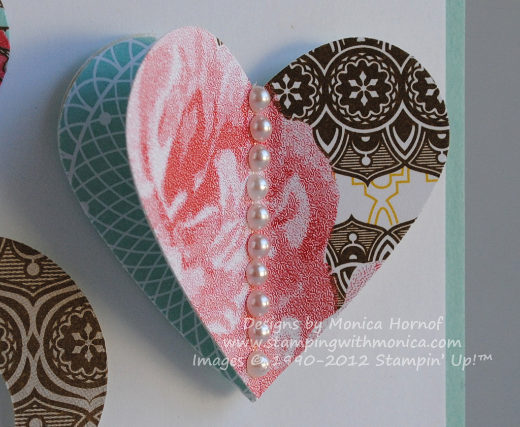
Well, we've had our first Stamper's Group for the year. With Valentine's day coming up I focused on Valentine's day related projects. I really liked a card I saw using mainly punches to make cute fishies, so we made a similar card. Secondly, for our first group I wanted to do something 3D rather than a card, so we made a Valentine's mailbox, filled with 12 Hershey's Kisses for my wonderful Stamper's Group Ladies :) I was really happy with how both projects turned out and certainly hope that the ladies enjoyed them too!

This is the 'Kissing Fishies' card. I thought it was unique because rather than using stamps to create the what we focus on, it uses mainly punches. I CASED this card, the idea for the fish and general layout came from a fellow Wisconsin Demonstrator Katie Resop.


The recipe for this card includes
Stamp Set: A Happy Heart, Itty Bitty Backgrounds
Cardstock: Baja Blue, Pink Pirouette, Tangerine Tango, Ridinghood Red, Textured Pacific Point
Ink: Baja Blue, Pacific Point, Ridinghood Red
Punches: 1 3/4" Circle, 5-Petal Flower, Scalloped Edge, Boho Blossoms
Other Accessories: Pretty in Pink 1/4" Grosgrain Ribbon, Stampin' Dimensionals, Googlie Eyes (dollar store)

The second project was the Valentine's mailbox. I used a template I found on the Demo SU! website (e-mail me if you'd like the template). The only difficulty I encountered was attaching the back 'flap' (i.e. the back end of the mailbox). So I created 3 1" x 1/4" paper tabs and attached it to the main rounded part of the mailbox once it was put together. What made this project relatively easy to prep was that most of the parts are rectangles which can just be cut with a paper cutter. The front and back flaps do require some cutting with scissors but it's easy (and I'm not one who likes to cut...)! The scoring is simple too. I used textured cardstock for the 'frame' of the mailbox, since it's a bit heavier than regular cardstock, and covered it with DSP.

All elements were put together using Sticky Strip. You definitely need the Sticky Strip to make sure it all stays together. Finally I stuffed the back half with red paper strips I bought at the dollar store. The stamp set used here is a Sale-a-Bration stamp set, 'Yummy'. I think it's very appropriate for this project ;) I embossed the images with Perfect Plum Craft Ink and Clear Embossing Powder. Here is the finished creation, I hope you like it as much as the ladies and I did!

The recipe for the this project is

Stamp Set: 'Yummy' (Sale-a-Bration)
Cardstock: Textured Pink Pirouette, Raspberry Tart DSP, Perfect Plum, Confetti White
Ink: Craft Perfect Plum
Punches: Designer Label, 1/8" Circle (retired)
Other Accessories: Silver Brads, Fire Circle Rhinestone Brads, Silver Elastic Cord (Holiday 2008 Occassions Mini), Heat Tool, Clear Embossing Powder, Paper Piercer, Mat Pack, Sticky Strip, Chocolate Chip 1" Double Stitched Grosgrain Ribbon, 1/4" Chocolate Chip Grosgrain Ribbon, Cellophane Bags

Want to learn how to make cool projects like this? Come to my Open House on February 21st and find out more! That's it for today, keep letting stamps bring out YOUR creativity!

Saturday, May 31, 2008

Blue and Silver - what a wonderful combination!

Wow, another post - I'm not doing all too bad with this blogging business :p I recently had the pleasure of making Thank You cards for a bride. Three cards for her bridesmaids, one for her mom, and another for her father. This lucky bride was actually a door prize winner from my Belly Laughs Mother's Day event - she won 5 handstamped cards! Her wedding colours are cornflower blue and silver, so after looking at my many designs, she chose the ones below and I adapted them to match her colours. I never thought to focus on this color combination so it was lots of fun to play and change my existing designs to fit :) I was thrilled with the result, as was the bride (which was most important). I also love how even though the cards all focus on silver and blue, they're all so very different. Here they are, they've definitely inspired me to choose a color combination and run with it to see what I come up with! Try it - it'll definitely get those creative juices flowing :D

For Dad:
For Mom:


For the Bridesmaids: